Whenever I work on display ads (marketing banners for the internet) I spend some quality time perusing the internet to find out what makes me click. Because the age and other customer demographics of my website are like me, I can guess that having ads that make me notice them, will make my viewers notice them to.
If your customers are not in your customer demographic, I would do a mini panel or quiz to ask your current customers which ads THEY would be most apt to click on.
So what is display ad conversion? In simple terms, it is when you have one or ads sitting there, and your ad gets clicked instead of the others. It also has to be compelling enough to make someone notice it outside of the content that they are already looking at.
Where Are Your Display Ads Positioned

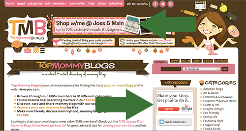
On the site (http://www.topmommyblogs.com/) the owners have ads at the top that direct to different areas of their website. The ads at the side (labeled sponsors) are outside advertisements. Now, they could be people who paid the site directly or they could be part of the google adwords network.
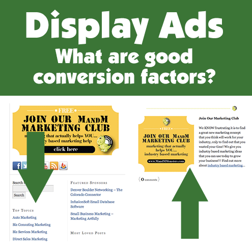
 Since I am doing ads for my own sites, I am going to be putting them in three main areas, in the sidebar, in the posts and at the end of the posts. Because I have my products and affiliate products to sell I am using my own websites and I can control which ads are sitting next to mine and where I want to direct people.
If you are buying ad space from someone else, you will need to make sure your ads are super special and generally AMAZING because they will be sitting next to other ads competing for space!
Some things I like about display ads
So I am not an expert in display ad marketing, I just have looked at hundreds of them and found some that I like and discovered some key factors for what would make me click them. Again, these ideas are just to get you started thinking, make sure to contact a company that is expert at this when you are ready to do your own ads!
 I think this is my favorite ad of all time! I like the photography (Wix is a photography website ? score!), I like how the cow is sticking out over the bottom part of the ad and overall it is a happy ad! That being said, there is no call to action, no click here or really anything else to do.
?
 This is one we did for our client, they have a great internal graphics department and started the ball rolling. That said, we added a call to action and made the person stand out from the background which is eye catching. Speaking of the person, people like looking at faces (people faces, animal faces, etc.) so you can rarely go wrong by adding an attractive person or fun animal in your ad.
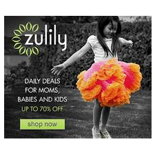
 Okay, whoever does the creative for Zulily is rocking my world! I do not buy children?s clothing and I am attracted to their ads. Love the contrast between the black and white with the pop of color and also the fact that they have a shop now call to action!
?
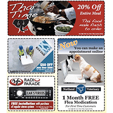
 These ads from Coupon money saver have a really neat premise?they have the coupon like border that we all know from offline marketing. They were interesting enough to jump out on a page of other display ads I was searching for!
?
?
Alright, enough about thinking about display ads, I have to leave you my fine friends and go make some for my business. Hopefully this has given you some inspiration for how you want to take your ad design and make sure there are some conversion factors included!
Display Ad Resources
Okay, can?t leave you hanging here, so here are some of my top display ad resources to keep you going!
Source: http://marketingartfully.com/2012/12/15/display-ads-what-are-good-conversion-factors/
Green Coffee Bean Extract september 11 adam levine 9/11 Memorial Google Docs 911 masterchef
No comments:
Post a Comment